Website feels like it’s missing something, pls critique

CDAPhoto

TPF Noob!
Joined
Oct 9, 2018
Messages
15
Reaction score
0
Location
Douglasville, GA, 30134 USA
Website
davidcannanphotography.com
Can others edit my Photos
Photos NOT OK to edit
My name is David and I live and west of Atl, Georgia. I own my solely photography business and don’t have any assistance with web development so I have been relying on GoDaddys web builder which I hate because it doesn’t let me track my sites traffic, set goals, track conversions, I’m also unable to any of my own html/java code to the page, or edit it in anyway outside if their predefined templates.

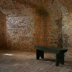
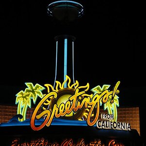
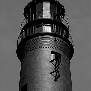
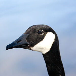
Knowing all of this I still put a lot of hard work into my page but still feel like I’m missing a ton. All of the photos taken are my own, I preferred it to using public stock images.

I’d very much appreciate it if some people would be willing to look at the page and give me their expertise and opinions.

Capture every detail, Fall in love with the photograph

Thank you
 
Since you're in business, I'm going to be brutally frank (bearing in mind that this is my opinion only).

1. Home Page: In a word... Ugh! An under-exposed monochrome of you taking a photo of yourself in the mirror. I don't care what you look like, and I'm going to assume you have a camera. This should be your BEST (or a series of your best) images. While I personally like white text on a black background, it is harder to read. Additionally your promotion banner for the "mini sessions" is so small as to be virtually pointless. Lastly, the brown as a contrasting colour is, IMO, less than optimal.

2. Blog: If you're not going to make regular, informative, and interesting posts, skip the blog altogether.

3. The Photo Gallery: A LOT of work needed here. You have out-of-focus images, images with terrible backgrounds, exposure issues, WB issues... and just plain too many images. There is some nice work there to be sure; you need to separate that from the average stuff. Like your home page, your galleries should only show your BEST work; maybe a dozen of each genre that you work in.

4. Booking & Contact: You advertise headshots (try "Business Portraits" it sounds a little more genteel), sports/athletic images and Standard [sic] Portraits, yet I see no evidence of ANY of those on your 'site; lots of family and children images, but nothing else. WHY would I book you for a business portrait if I can't see an example of your work? You have 30 & 45 minute sessions; personally I feel that is very little time in which to work. I would recommend one hour as your minimum session duration. For the high school senior portraits your session length is one hour and twenty minutes; that seems like a VERY awkward length of time; blow the bundle and add another ten minutes to make it a nice, even ninety minutes! I would also question your promises of the client receiving "10-15" or "10" images.

Why does one session allow 10-15 and another only 10? Further you should always avoid promising a specific number. What happens if things go pear-shaped and you only get eight images? It can [will] happen. Oh, and ellipses have specific meaning in punctuation. They're also endangered. Consider conserving them!

Lastly, and potentially most importantly, how do you expect to make any money? Depending on your costs, your session fees are reasonable, but there's no mention of print sales and you seem to indicate that you're just GIVING the customer a big bunch of high-resolution digital files. By the time you pay for your business license, insurance, gear upgrades, fuel, Internet, et cetera, et cetera, et cetera, your session feel will likely cover your costs. Your product should provide your profit, but there's no mention of that.

Edited to add: You need to make your location clearly evident. If I come across your website, I want to know immediately if you're viable from a location point of view. Also, consider trimming your pages. People are lazy, they're not likely to scroll down.
 
Last edited:

Most reactions

New Topics

Back
Top