Little dancer

nas-matko

TPF Noob!
Joined
Feb 15, 2024
Messages
32
Reaction score
11
Location
Slovakia
Hi,

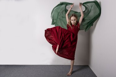
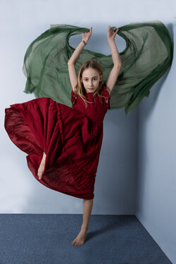
because I have found this forum excellent source of opinions and advices, I am taking liberty and posting another picture for your comments. Goal was to create calm portrait of little dancer and achieve colour harmony at the same time. However final result is in my opinion little bit cold, what can be done to improve it? I was studying different color hamonies and it seems like its missing blue in the mixture, but blue is also cold, so I am bit unsure.

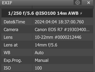
Technical details are here
Screenshot 2024-04-24 at 16.02.07.png
I used one 300Ws flash in umbrella and diffuser, image was cropped in post and cloned in little background at the edges to maintain aspect ratio, clonned out little wooden piece connecting carpet and wall, other than that no major editing. Thanks for your opinions.

834A3357 terezka cervene saty crop2.jpg


This is example, after pushing some blue into the shadows, not sure if it is better or worse
834A3357 crop color harmony.jpg
 
Last edited:
Goal was to create calm portrait of little dancer and achieve colour harmony at the same time.

Not sure what you mean about create a calm portrait??? To me calm equates to lack of movement, which in this case is the opposite.

Not sure what you mean about "Calm". To me calm is lacking movement, which in this case is the opposite.

Color consideration dates back to Aristotle, however, modern Color theory began to come into being in the early18th century. In Photography it's based on the principle that there are three primary colors- Red, Yellow, and Blue and three secondary colors Orange, Green and Violet these are all equally spaced around the color wheel. Mixing these (combined with luminescence) you can obtain any other Tone or Shade. Color theory is defined as practical guidance for visual artists and designers that helps them come up with color schemes, mix colors, and define colors as we see them.

Untitled.jpg


The most basic of schemes is Complimentary they are directly opposite on the color wheel. The problem you're having in your image is that your Red is shifted toward Purple and your Green toward the Blue. To balance the dress, the cape would need to shift toward the Yellow for a Complimentary Scheme. Other options would be to leave the dress and cape as is but additional color for a split complementary (3 colors, isosceles triangle), triadic (3 colors, equilateral triangle), square (4 colors) or rectangle (4 colors).

Color management is a little detail oftern overlooked in composition, but as you found, it shows up when it's off.
 
Not sure what you mean about "Calm". To me calm is lacking movement, which in this case is the opposite.
Sorry for bad word choice, english is not my first language, what I meant by calm was opposite of dramatic.

colour harmony I am thinking of is a square, with orange in the skin, red in the dress, green in the scarf, so blue was missing.
 
Sorry for bad word choice, english is not my first language, what I meant by calm was opposite of dramatic.

colour harmony I am thinking of is a square, with orange in the skin, red in the dress, green in the scarf, so blue was missing.

No problem.

You have two problems with your thinking.....Scarf is not green, it's falling to toward the blue with an RGB(103, 124,105) pure green is (0,139,41) , and Caucasian skin isn't orange, it will vary by nationality, but a sample from just above the bridge of the nose for her is RGB(197,165,152) putting it more heavily toward red/Blue

Here's a quick edit with her in a complimentary scheme, adjusted slightly because dress is not true Red.
834A3357 terezka cervene saty complimentary.jpg


With Red as the primary corner and Green as the opposite corner of the square you would need some blue and yellow/gold, to do a square, but frankly It's pushing it. Red and Green are dominant warm colors, they don't play well with others. Yellows are also warm, while Blue is cool. Warm colors advance snd cool recedes. A better choice if you want the square scheme would be to "accessories" with jewelry, shoes, etc, which won't compete for attention with Red and Green.
Untitled111.jpg
 
Last edited:
For me, the most important part of the picture is the expression on the girl's face. I wish it was more animated. She does not look excited.

The other thing for me is that the setting looks crowded. The subject needs more space. It might be possible to remove the background and try some possibilities - seamless white might work, or a spacious hall.
She was excited about new dress, but she was so focused on the posing, movement of the scarf that excitement in the face is not that obvious.
I understnd what you mean by space, my original picture was like this
834A3357 terezka cervene saty.JPG
but after discussion with people I decided to go for tighter crop, its probably more personal preference and feeling.
 
She was excited about new dress, but she was so focused on the posing, movement of the scarf that excitement in the face is not that obvious.
I understnd what you mean by space, my original picture was like this
View attachment 274501
but after discussion with people I decided to go for tighter crop, its probably more personal preference and feeling.
When I mentioned space, I was thinking about how close she was to the two walls. She doesn't have much space to move.
 
Scarf is not green, it's falling to toward the blue with an RGB(103, 124,105) pure green is (0,139,41) , and Caucasian skin isn't orange, it will vary by nationality, but a sample from just above the bridge of the nose for her is RGB(197,165,152) putting it more heavily toward red/Blue
Is your eye trained to see this color shifts, or do you sample always like this?
Red and Green are dominant warm colors, they don't play well with others. Yellows are also warm, while Blue is cool. Warm colors advance snd cool recedes. A better choice if you want the square scheme would be to "accessories" with jewelry, shoes, etc, which won't compete for attention with Red and Green.
This is very good point, I didn't realize that color doesn't need to be big, its the presence of that color that counts.
However, do you plan your colors in advance or do you try to color correct in post to create particular harmony?
 
Is your eye trained to see this color shifts, or do you sample always like this?

I'd say that my ability to see color is better than average, however, these things change over time, and vary between people. One of the most shocking things occurred a few years ago, with Cataract surgery, they do one eye at a time. After the first eye was done alternating between closing one and the other, the shift in White was huge. The repaired eye saw White, the one not repaired yet saw dingy yellow. The human brain will automatically correct for color....it knows white should be white, so you think you're seeing white, a camera doesn't, it registers what it actually sees, hence the need to correct for WB.

As to sampling, it depends on how critical the edit is. For casual edits I don't sample much, but when it's required I do. I have a library of skin samples that are sometimes used when correcting skin blemishes for not only color but texture. Tone mapping is another area where knowing how to adjust the color to known standards is needed.

This is very good point, I didn't realize that color doesn't need to be big, its the presence of that color that counts.
However, do you plan your colors in advance or do you try to color correct in post to create particular harmony?

The human brain is capable of picking out the smallest of details in an image, so yes even spots of color can make a difference. With studio portraits, "EVERYTHING" is planned before. If you've done all your prep work correctly the shutter release is nothing more than recording your work. That's not to say that there isn't editing required post, but even that it taken into consideration in the planning stage.
 
I understnd what you mean by space, my original picture was like this

One of the reasons, we have the more strict guidelines in the C&C forum is so that we can provide specific discussions on what the OP is searching for. I wasn't going to bring it up as it wasn't germane to your post, but since it's now being discussed, placing her in a corner like that is not a good idea, it creates unnecessary distractions. A side wall like that can be used as a large reflector to bounce light, but it should be out of the frame. When you're shooting in front of any background you need to have the subject 6-8 ft in front of it to minimize shadows cast, and blur the background.
 
Thanks for valuable comments, its never ending learning and I am thankfull for tis c&c gallery as I am not seeking likes but rather critical comments to help me advance.
 
One of the reasons, we have the more strict guidelines in the C&C forum is so that we can provide specific discussions on what the OP is searching for. I wasn't going to bring it up as it wasn't germane to your post, but since it's now being discussed, placing her in a corner like that is not a good idea, it creates unnecessary distractions. A side wall like that can be used as a large reflector to bounce light, but it should be out of the frame. When you're shooting in front of any background you need to have the subject 6-8 ft in front of it to minimize shadows cast, and blur the background.
I am not sure about the culture here in the C&C area, but sometimes in life one hears a comment or question, and the real issue seems to be something different. That was my reaction to the original post. I think the colors are fine. They are desaturated red and green and are in balance IMO. Adding the blue is not good.

The real issues for me were the expression and the crowded appearance. Given the settings of the camera, it seems the photographer had very little room for the shoot. Therefore background replacement in post might be the best way to get a more open feeling to the photo, if the shoot can't be moved elsewhere.

Unlike the other galleries where comments can/do go off the rails quickly, C&C was implemented so that information pertinent to a member question could be given without confusion and in the specific direction they seek advice. I direct you to reread #2 in the guidelines "In a sentence or two, please let us know what you were trying to achieve with your shot. Letting us know why you took the shot helps us understand your creative thought process, which will inform how someone might respond". While it's not against the guidelines to offer advice on things not asked, it is wise to keep those to a minimum until the members actual questions are answered.

As to the question on Color Scheme my answers were based on fact not opinion. The OP was attempting to create a Square color scheme (per his words), the image did not meet the requirements for same.

Once you get past technical elements no one's opinion including mine are any more relevant than others. All opinions are welcome here and in many cases the spark that leads to greater insight.
 
I understand that you want to keep the thread as focued as possible which is good.
Personally I don’t mind comments unrelated to my direct question if there is something obviously not right, like the composition in the corner.

i tried to execute simpler complementary harmony with the same subject and the same dress, I removed gren scarf and replaced it with red and used green in the background, same equipment and lens, shall I start new thread or may I continue this one?
 
@nas-matko as long as the subject and general question line is the same, edits and additional shots are fine. If you're seeking a different line of questions then a new post is better.
 

Most reactions

New Topics

Back
Top