Senior Portraits - 2012 - C&C

Heather Koch

No longer a newbie, moving up!
Joined
Oct 10, 2014
Messages
652
Reaction score
155
Location
Michigan
Can others edit my Photos
Photos OK to edit
Yet another thread... But I wanted to share my first ever portraits of my sister back in 2012. This was when I was just starting out to be... More "professional" and get serious about photography.

But I think this will be good for me, as its a new setting than my other posts and I believe some very clear quality here...

C&C Welcome!

1.
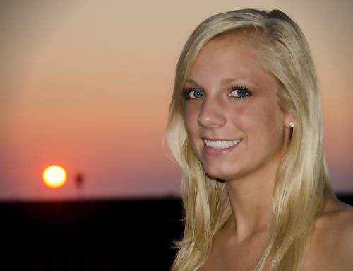
SarahSeniorSun by heather.koch43, on Flickr

2.
SarahSeniorCloseup by heather.koch43, on Flickr

3.
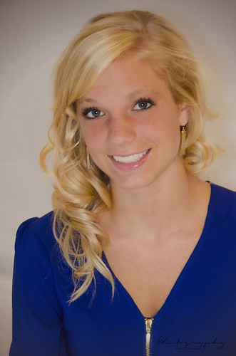
SarahSeniorWhite4copy by heather.koch43, on Flickr


4.
SarahSEnniorr by heather.koch43, on Flickr


For the rest of the photos check out my Flickr account
 
These are pretty good. I like #3 the best but the lighting rather flat. I didn't think portrait photography would be so much fun and at the same time so much to learn. You will benefit from better lighting in the sense of using shadows and highlights to create depth.
There are 3 exposure levels:
1. What the meter says is right for your scene. This you don't control.
2. Under exposed areas for shadows. This you control.
3. Over exposed areas for highlights. This you control.
Learning to use light is so important.
Also the subject of posing gets very interesting. I bought Doug Boxes book called "Guide to Posing" and it has been a good read. Videos are also available on You Tube.
But Have Fun!

Thank you, yes I do need to look up some more on poses. That is one thing I am at a lost for. Im usually pretty creative but when it comes time to, "Okay, how do we pose next?" I'm at a loss... But yes lighting, lighting, lighting!

For that particular shot, it was in my basement, with overhead lights (basic light bulb) I used two florescent desk lamps, I created my own reflector with cardboard and tinfoil, as well as my own diffuser for my on-camera flash. I attached a photo of it.

I will have to check that book out for sure!
 

Attachments

  • photo-2-2.jpg
    photo-2-2.jpg
    134 KB · Views: 179
Totally cool diffuser.. :) Because the flash is on camera there are no shadows and that's the first thing to solve.
 
I feel like the lighting in each of these is flat and unflattering. Flat light, such as the light that comes from a pop-up flash on top of your camera, erases three dimensional detail. I would recommend getting the flash off of your camera, or using natural light by itself.

I personally don't understand how you can effectively improve by asking for feedback on work that is over 2 years old. This doesn't represent your progress to date, and I think you will receive much better feedback that will help you improve by posting more current work.

I agree, but I remember everything about this shoot, as I spent a lot of time on it. So it helps me...

But I have another shoot this weekend, in DIY studio, so you will be seeing photos then.
Do you shoot exactly the same now as you did when you captured these images, or has your knowledge and technique changed since? I would be concerned if there has been zero change in two years.
 
Last edited:
I agree with Dan.

#4 is the best of the bunch.
 
Of course I have changed. But don't you learn from your past mistakes?
 

Most reactions

New Topics

Back
Top