daisyish

TPF Noob!
Joined
Sep 25, 2015
Messages
56
Reaction score
18
Can others edit my Photos
Photos OK to edit
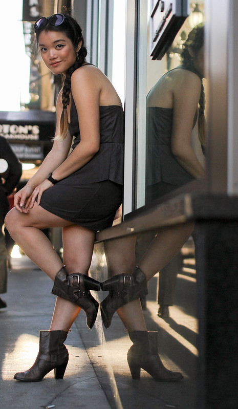
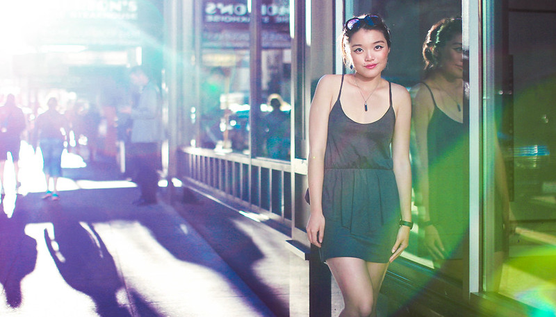
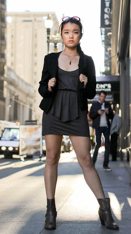
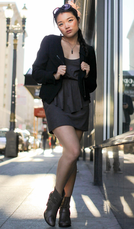
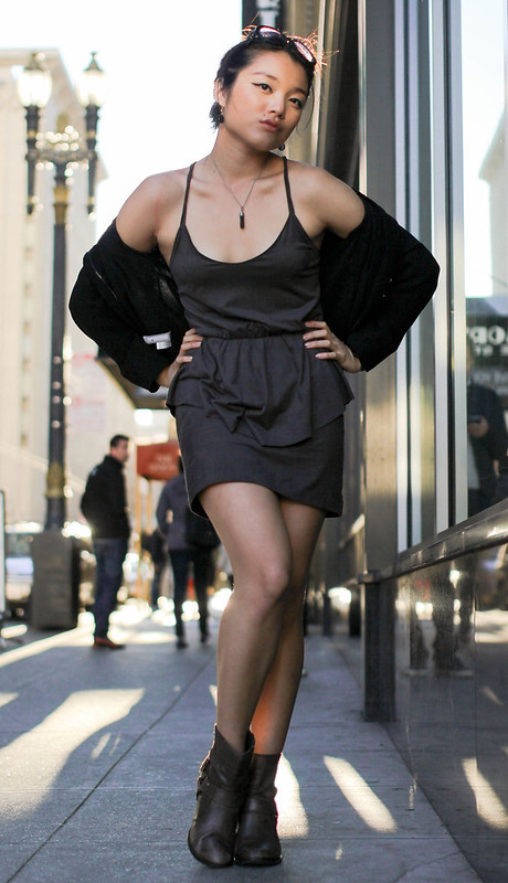
Hey everyone! Here are some more photos for my fashion blog. I edited the first four in Lightroom and the last one in both Lightroom and Photoshop. First time trying the sync feature in Lightroom! It worked really well. Any thoughts on coloring, composition, lighting, etc.? Again I didn't take the photos, but I did edit them!

1.


2.


3.


4.


5.
 
Again I didn't take the photos, but I did edit them!
Do you own the publishing rights to these photographs? As stated in the rules, we cannot post photos that we do not own.

As for a rough critique; these first four need light on the model. The last one is pretty well run through the wringer, so I don't know what to say about it.
 
It seems like a good set to me. Here is my C&C for you.

#1
I like, but you have to much of a dark corner on the left side (camera right) of the face. I don't know if this is from the edit or the lighting at the shoot itself. You can probably fix it by using a dodge tool in PS. Other wise it looks great!

#2
The only thing would be maybe a little more fill light on the bottom half of the face. But that is a BIG maybe, it really looks good as is.

#3
The light and such looks good on this one, but the pose looks out of place for the location. But this one is just my personal thought on it, the photo other looks good.

#4
This one is only lacking two things to me. It needs more room on the left side, it feels cramped.
And you need some light on that beautiful face! Some light would bring out the sparkle.

#5
I normally am not a very big fan of sun flare, but this one really click as soon as I saw it!
The face is lit very nicely, it really has that Sparkle! With great eye contact, I just love it!!!:1219:


Do remember that I am still new to this, so I maybe wrong on somethings.
Who is the camera man? :)
 
Again I didn't take the photos, but I did edit them!
Do you own the publishing rights to these photographs? As stated in the rules, we cannot post photos that we do not own.

As for a rough critique; these first four need light on the model. The last one is pretty well run through the wringer, so I don't know what to say about it.


Yes I do have the rights! My friend took the photos for me to have. And thank you for your comments. The sun was back lighting me, so we didn't have any light coming from the front.
 
Again I didn't take the photos, but I did edit them!
Do you own the publishing rights to these photographs? As stated in the rules, we cannot post photos that we do not own.

As for a rough critique; these first four need light on the model. The last one is pretty well run through the wringer, so I don't know what to say about it.

I liked that one!:lol:
 
The sun was back lighting me, so we didn't have any light coming from the front.

You should make a small reflector on a stand, that you can take on shoots! :)
 
Who is the camera man? :)

The camera man is one of my friends. You can find his portfolio at Ankur Maniar Portfolio :1219:

And thank you for your critiques! I will try the dodge tool on photo 1 and recropping and adding more light to photo 4. Do you know how to add more light to a photo?
 
It seems like a good set to me. Here is my C&C for you.

#1
I like, but you have to much of a dark corner on the left side (camera right) of the face. I don't know if this is from the edit or the lighting at the shoot itself. You can probably fix it by using a dodge tool in PS. Other wise it looks great!

I tried the dodge tool to brighten up the photo! Does it look better? Or is the difference too small to really tell? >.<

Before:


After:

 
Thanks for the link to your photographer. Ankur's website is pretty impressive (except for his drawings). I like how he writes his "About Me" blurb in the third person :allteeth:. Looking forward to seeing some photos with you behind the lens.
 
Photo #1 is the best by far. I love the guy with the classic old-school tennis shoes and the phone held in his hand, kind of creepin' on her...which is ALSO going on in shot #3, except in that shot, we have a man walking down the street with a girlfriend doing a bold, broad daylight, over the shoulder look-back at the girl in the mini-dress. The attention she is drawing from men in the background of both shots is a pretty obvious device, but it gets the message across: this outfit will turn heads.
 
I think the front rather than side views show the outfit the best if that's what you want your readers to see. The hair needed to be checked and arranged/combed - the sunlight hitting it makes it really noticeable in some (maybe happened when moving from one pose to another).

To me the occasional patch of sunlight makes the skin look more golden in places and it would have helped when setting up the shots to adjust the poses to take that into consideration (where you wanted the sunlight to hit, it could have been used to your advantage).

The photographer owns the copyright to the photographs unless there's something in writing to indicate otherwise. Usually for example, work for hire involves a photographer giving up rights to the photos and any income from them (and the photographer would be hired and paid for the work). Rights to the photos are usually licensed by a client (you) in a contract for a specific use or purpose, for a specific amount of time, etc. Even if you do this in trade (for example, he can use the photos in his portfolio, you can use them on your blog) it would be a good idea to learn how to license usage of photos from photographers.

A Copyright Primer | American Society of Media Photographers
 
It seems like a good set to me. Here is my C&C for you.

#1
I like, but you have to much of a dark corner on the left side (camera right) of the face. I don't know if this is from the edit or the lighting at the shoot itself. You can probably fix it by using a dodge tool in PS. Other wise it looks great!

I tried the dodge tool to brighten up the photo! Does it look better? Or is the difference too small to really tell? >.<

Before:


After:


There is little you can do to add light, with something this dark, so #4 will just have to stay dark. But it is still nice. :)

I did some work on #1, what do you think? I used the "Lasso" tool to copy the well lit side of the face, flipped the copy, and pasted it over the dark side. I then used a cloning tool to blind it a little. :)

21957242181_683004302d_c.jpg
 
Photo #1 is the best by far. I love the guy with the classic old-school tennis shoes and the phone held in his hand, kind of creepin' on her...which is ALSO going on in shot #3, except in that shot, we have a man walking down the street with a girlfriend doing a bold, broad daylight, over the shoulder look-back at the girl in the mini-dress. The attention she is drawing from men in the background of both shots is a pretty obvious device, but it gets the message across: this outfit will turn heads.

Good point! She should put this back on and have her photographer friend get some steer shots of the guys!:biglaugh:

I think the front rather than side views show the outfit the best if that's what you want your readers to see. The hair needed to be checked and arranged/combed - the sunlight hitting it makes it really noticeable in some (maybe happened when moving from one pose to another).

To me the occasional patch of sunlight makes the skin look more golden in places and it would have helped when setting up the shots to adjust the poses to take that into consideration (where you wanted the sunlight to hit, it could have been used to your advantage).

The photographer owns the copyright to the photographs unless there's something in writing to indicate otherwise. Usually for example, work for hire involves a photographer giving up rights to the photos and any income from them (and the photographer would be hired and paid for the work). Rights to the photos are usually licensed by a client (you) in a contract for a specific use or purpose, for a specific amount of time, etc. Even if you do this in trade (for example, he can use the photos in his portfolio, you can use them on your blog) it would be a good idea to learn how to license usage of photos from photographers.

A Copyright Primer | American Society of Media Photographers
Her and the photographer should wright up a "contract" that they both like, just to keep them both covered. :)
 
I think the front rather than side views show the outfit the best if that's what you want your readers to see. The hair needed to be checked and arranged/combed - the sunlight hitting it makes it really noticeable in some (maybe happened when moving from one pose to another).

To me the occasional patch of sunlight makes the skin look more golden in places and it would have helped when setting up the shots to adjust the poses to take that into consideration (where you wanted the sunlight to hit, it could have been used to your advantage).

The photographer owns the copyright to the photographs unless there's something in writing to indicate otherwise. Usually for example, work for hire involves a photographer giving up rights to the photos and any income from them (and the photographer would be hired and paid for the work). Rights to the photos are usually licensed by a client (you) in a contract for a specific use or purpose, for a specific amount of time, etc. Even if you do this in trade (for example, he can use the photos in his portfolio, you can use them on your blog) it would be a good idea to learn how to license usage of photos from photographers.

A Copyright Primer | American Society of Media Photographers
Thank you for this link really helpful. The photographer is a really close friend, and the purpose of the photoshoot was to get pictures for my blog. So it might be a little weird to establish a contract between us since we are so close. But for future reference this is really great.

Thank you for the critiques as well!
 
[/QUOTE]


There is little you can do to add light, with something this dark, so #4 will just have to stay dark. But it is still nice. :)

I did some work on #1, what do you think? I used the "Lasso" tool to copy the well lit side of the face, flipped the copy, and pasted it over the dark side. I then used a cloning tool to blind it a little. :)

View attachment 109245[/QUOTE]

Haha ehhh not sure if I like it... But only because it makes the face look completely different. But really good job! If I looked at this picture first I would think it was taken that way.
 

Most reactions

New Topics

Back
Top